

Responsive design is a way of building a website so that it automatically adapts to any screen: desktop, laptop, tablet or phone. The content is the same, but the layout, text size and images change so everything is comfortable to read and use. Today it’s not an extra: it’s the foundation of any professional website.
In this article we explain exactly what it is, why Google cares so much about it and how to tell whether your site is properly adapted.
What is responsive design?
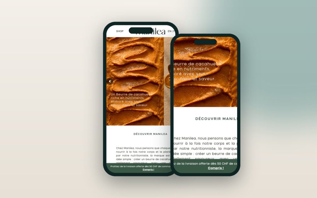
A responsive site uses a single version of each page that rearranges itself based on the screen width. For example, a menu with six options on desktop becomes a menu button on a phone. And three columns of services are shown one below the other.
It used to be common to have two sites: a “normal” one and a “mobile” one (sometimes at an address like m.yoursite.com). That model doubled the work and caused errors. Responsive design, instead, keeps a single site, a single address and a single set of content for everyone.
How it works under the hood
Without getting too technical, it relies on three ideas:
- Flexible grids: columns are measured in proportions rather than fixed sizes.
- Adaptive images: the browser downloads a lighter version of each photo when the screen is small.
- Rules by screen size: beyond a certain width, the layout changes.
Why responsive design is essential
Most visits to a website come from a phone. If your page forces people to zoom in, has tiny buttons or text that runs off the screen, visitors leave within seconds. And that visitor could have been a customer.
Google indexes the mobile version first
Google uses the mobile version of your site as its main reference to decide where to rank it. This is known as mobile-first indexing. That’s why a site that only looks good on desktop starts at a disadvantage in SEO.
More leads and more sales
A site that’s comfortable to use on a phone converts better. A WhatsApp button, a phone number you can call with one tap or a short form make all the difference. And in an online store, every extra step in the mobile checkout means lost sales.
How to tell if your site is responsive
You can run a quick test yourself:
- Open your site on your phone and browse the main pages.
- Check that you don’t have to zoom in to read.
- Tap the buttons and links: they should be easy to press without mistakes.
- Make sure images aren’t cropped or distorted.
- Fill out the contact form from start to finish.
You can also use free tools like Google’s PageSpeed Insights, which measures speed and the mobile experience. If the result comes out red, it’s worth looking into.
Common mistakes on sites that don’t adapt well
- Pop-ups that cover everything and can’t be closed on a phone.
- Text inside images, which becomes unreadable on small screens.
- Heavy sliders on the home page that take ages to load on mobile data.
- Wide tables that force you to scroll sideways.
- Menus that won’t open or have hidden submenus.
Responsive design at Kaanah Solutions
Every site we build at Kaanah is responsive from the very first sketch. We design for mobile first and then scale up for large screens. That way the experience is good on every device, not a last-minute “fix”.
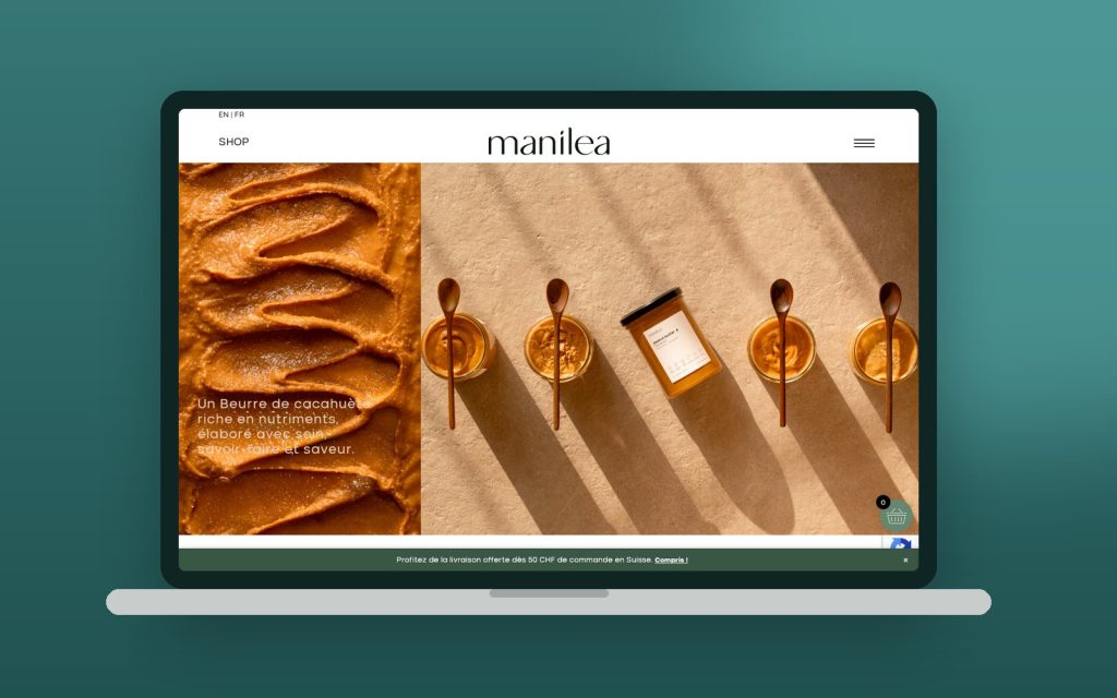
You can see examples in our portfolio, where every project is shown on a laptop and on a phone. If your current site doesn’t adapt well, we can help with a website redesign or with specific fixes.
Want to know how your site is doing? Ask us for a free review and we’ll tell you what to improve.